
Identity · Print · Social · Motion
Zwei Café
Client:
Zwei
Category:
Identity · Print · Social · Motion
Year:
2026
Client:
Zwei
Category:
Identity · Print · Social · Motion
Year:
2026

Project Overview
Zwei is a specialty coffee bar inside the new Music Academy campus in Bydgoszcz. Before any colours, I talked with the founders about the place they wanted: calm, a bit nerdy and about the coffee rather than the Instagram backdrop. I started with very little: one simple logo idea and a very loud red. The campus is big, modern and full of sharp angles, so the identity had to hold its own there without shouting over it.
Zwei is a specialty coffee bar inside the new Music Academy campus in Bydgoszcz. Before any colours, I talked with the founders about the place they wanted: calm, a bit nerdy and about the coffee rather than the Instagram backdrop. I started with very little: one simple logo idea and a very loud red. The campus is big, modern and full of sharp angles, so the identity had to hold its own there without shouting over it.
Zwei is a specialty coffee bar inside the new Music Academy campus in Bydgoszcz. Before any colours, I talked with the founders about the place they wanted: calm, a bit nerdy and about the coffee rather than the Instagram backdrop. I started with very little: one simple logo idea and a very loud red. The campus is big, modern and full of sharp angles, so the identity had to hold its own there without shouting over it.
It all started with the building.


I traced the campus's slanted, trapezoid roofline and used those angles to shape the letters.


What did I take from it? The roofline.
What did I take from it?
The roofline.
What did I take from it?
The roofline.


Geometry · Architecture · Blueprints · Glass

And then - halfway through the project, I've changed the logo.
And then - halfway through the project, I've changed the logo.
And then - halfway through the project, I've changed the logo.

The first version of the logo was simpler and geometric. It even resembled working-class letters to the point.
FROM LOGO TO LAUNCH KIT
What started as "just a logo" became everything the café needed to open:
stickers and stamps, social posts and story templates, profile icons, photos, A5 menus, a loyalty card, business cards, illustrations, color palettes, and short logo animations.
When the logo changed, I went back through every piece and re-tuned it, so the new mark and the existing materials still read as one brand.
One identity, many pieces

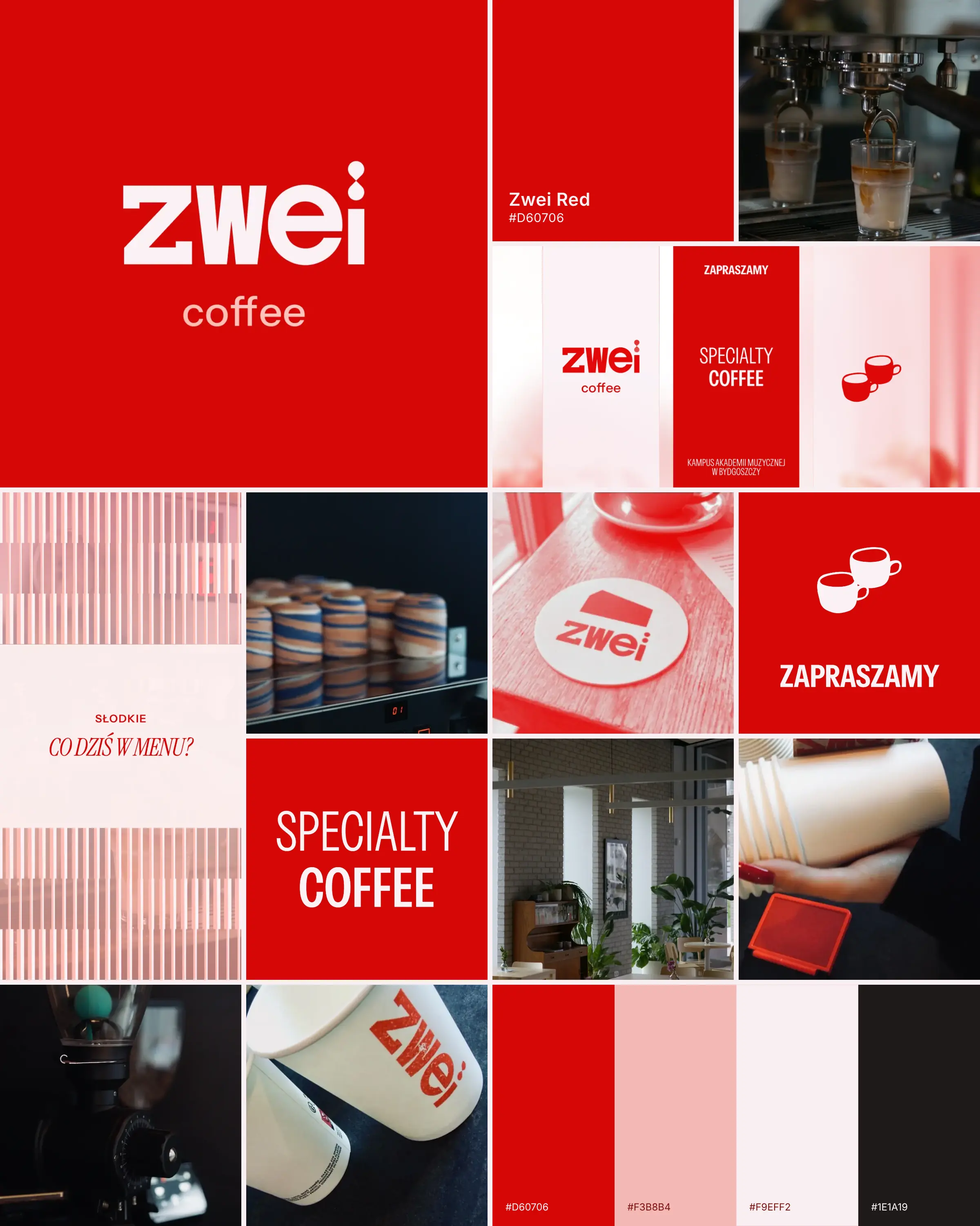
The new "zwei" is heavier, the "z" got its notched corners, and the dot turned into two drops: one falling into the other, like the last drop of espresso hitting the cup.
A small nerdy detail for people who look twice.
Grid, shapes, patterns
Everything sits on a 12-column grid. The shapes come straight from the campus architecture: simplified outlines of the building became a background pattern, frames for photos and solid blocks of colour. That structure is what keeps things calm, even when one menu has to fit red, coffee, cake and a seasonal promo on the same page.
Colour & type
Red (#E20909) is the brand's voice, built out into a full scale from pale pink to almost black and paired with a warm dark (#281F20) and soft pinks.
In everyday use red works as an accent; the launch pieces, like menu covers and opening posts, are allowed to go full red.
colors & Typography

Instrument Sans does the practical work. Instrument Serif comes in for the softer moments: seasonal headings, slogans and little notes like "Cøffee is life!".
GRID, SHAPES
Instrument Sans does the practical work. Instrument Serif comes in for the softer moments: seasonal headings, slogans and little notes like "Cøffee is life!".
Colour & type
Grid, shapes, patterns
Everything sits on a 12-column grid. The shapes come straight from the campus architecture: simplified outlines of the building became a background pattern, frames for photos and solid blocks of colour.
That structure is what keeps things calm, even when one menu has to fit red, coffee, cake and a seasonal promo on the same page.
Red (#E20909) is the brand's voice, built out into a full scale from pale pink to almost black and paired with a warm dark (#281F20) and soft pinks.
In everyday use red works as an accent; the launch pieces, like menu covers and opening posts, are allowed to go full red.
Social Templates
Social Templates

Deliverables
Logo & monogram · Colour system · Typography · Pattern & shapes · Stickers & stamps · A5 menus · Loyalty card · Business cards · Social templates · Motion & 3D logo · Brand guidelines
What started as "just a logo" became everything the café needed to open: stickers and stamps, social posts and story templates, profile icons, photos, A5 menus (the everyday "klasyk" and a seasonal autumn edition), a loyalty card, business cards, illustrations, colour palettes and short logo animations.
When the logo changed, I went back through every piece and re-tuned it, so the new mark and the existing materials still read as one brand.
FROM LOGO TO LAUNCH KIT
FROM LOGO TO LAUNCH KIT
What started as "just a logo" became everything the café needed to open: stickers and stamps, social posts and story templates, profile icons, photos, A5 menus (the everyday "klasyk" and a seasonal autumn edition), a loyalty card, business cards, illustrations, colour palettes and short logo animations.
When the logo changed, I went back through every piece and re-tuned it, so the new mark and the existing materials still read as one brand.
FROM LOGO TO LAUNCH KIT
FROM LOGO TO LAUNCH KIT
What started as "just a logo" became everything the café needed to open: stickers and stamps, social posts and story templates, profile icons, photos, A5 menus (the everyday "klasyk" and a seasonal autumn edition), a loyalty card, business cards, illustrations, colour palettes and short logo animations.
When the logo changed, I went back through every piece and re-tuned it, so the new mark and the existing materials still read as one brand.
One identity, many pieces
Grid, shapes, patterns
Everything sits on a 12-column grid. The shapes come straight from the campus architecture: simplified outlines of the building became a background pattern, frames for photos and solid blocks of colour.
That structure is what keeps things calm, even when one menu has to fit red, coffee, cake and a seasonal promo on the same page.
Colour & type
Red (#E20909) is the brand's voice, built out into a full scale from pale pink to almost black and paired with a warm dark (#281F20) and soft pinks.
In everyday use red works as an accent; the launch pieces, like menu covers and opening posts, are allowed to go full red.
The new "zwei" is heavier, the "z" got its notched corners, and the dot turned into two drops: one falling into the other, like the last drop of espresso hitting the cup.
A small nerdy detail for people who look twice.
Instrument Sans does the practical work. Instrument Serif comes in for the softer moments: seasonal headings, slogans and little notes like "Cøffee is life!".
Social Templates
Social Templates


Social Templates


Other
Projects
Portfolio


Let’s Build A Brand Experience That People Remember And Trust
We Design Brands That Speak Clearly, Feel Human, And Stand Confidently Apart
Turning Ideas Into Carefully Crafted Brand Experiences That Last
Strategic Design Built To Help Modern Brands Grow With Purpose