Hero BG
Content system · Illustration · Editorial

Wimdu – Brand Ownership & Content System

Client:

Wimdu

Category:

Content system · Illustration · Editorial

Year:

2015–2018

Client:

Wimdu

Category:

Content system · Illustration · Editorial

Year:

2015–2018

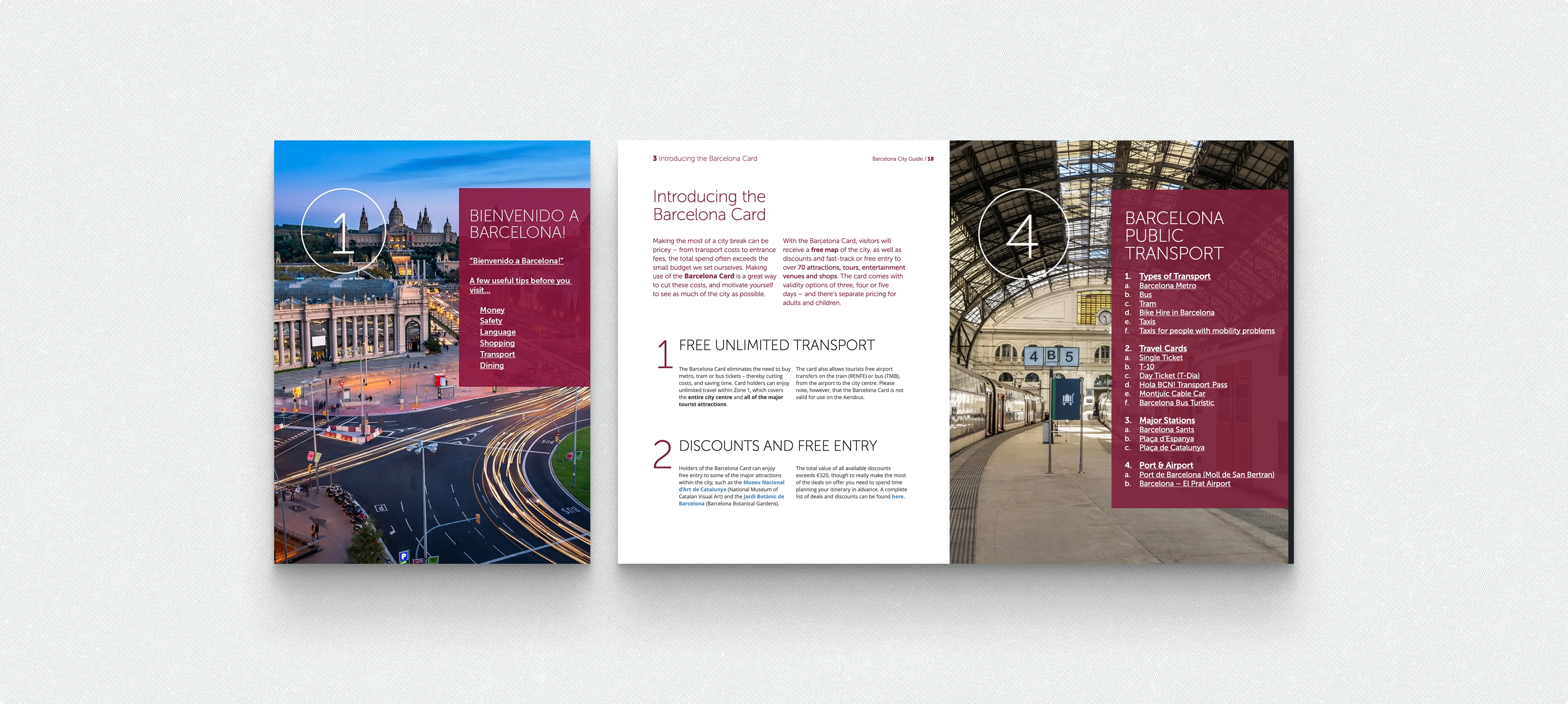
Wimdu City Guide

Project Overview

Wimdu was a Berlin-based holiday rental platform working in more than 30 markets. I joined as a PM intern and six months later moved into a full brand designer role. I stayed two years in-house and kept working with the team as a freelancer after that. Layout (translated to several languages) had to survive longer words, other date formats and local currencies without being rebuilt each time.

Wimdu was a Berlin-based holiday rental platform working in more than 30 markets. I joined as a PM intern and six months later moved into a full brand designer role. I stayed two years in-house and kept working with the team as a freelancer after that. Layout (translated to several languages) had to survive longer words, other date formats and local currencies without being rebuilt each time.

Wimdu was a Berlin-based holiday rental platform working in more than 30 markets. I joined as a PM intern and six months later moved into a full brand designer role. I stayed two years in-house and kept working with the team as a freelancer after that. Layout (translated to several languages) had to survive longer words, other date formats and local currencies without being rebuilt each time.

The first version of the logo was simpler and geometric. It even resembled working-class letters to the point.

FROM LOGO TO LAUNCH KIT

What started as "just a logo" became everything the café needed to open:

stickers and stamps, social posts and story templates, profile icons, photos, A5 menus, a loyalty card, business cards, illustrations, color palettes, and short logo animations.

When the logo changed, I went back through every piece and re-tuned it, so the new mark and the existing materials still read as one brand.

One identity, many pieces

Grid, shapes, patterns

Everything sits on a 12-column grid. The shapes come straight from the campus architecture: simplified outlines of the building became a background pattern, frames for photos and solid blocks of colour. That structure is what keeps things calm, even when one menu has to fit red, coffee, cake and a seasonal promo on the same page.

Colour & type

Red (#E20909) is the brand's voice, built out into a full scale from pale pink to almost black and paired with a warm dark (#281F20) and soft pinks.

In everyday use red works as an accent; the launch pieces, like menu covers and opening posts, are allowed to go full red.

colors & Typography

Instrument Sans does the practical work. Instrument Serif comes in for the softer moments: seasonal headings, slogans and little notes like "Cøffee is life!".

GRID, SHAPES

Instrument Sans does the practical work. Instrument Serif comes in for the softer moments: seasonal headings, slogans and little notes like "Cøffee is life!".
Colour & type
Grid, shapes, patterns

Everything sits on a 12-column grid. The shapes come straight from the campus architecture: simplified outlines of the building became a background pattern, frames for photos and solid blocks of colour.

That structure is what keeps things calm, even when one menu has to fit red, coffee, cake and a seasonal promo on the same page.

Red (#E20909) is the brand's voice, built out into a full scale from pale pink to almost black and paired with a warm dark (#281F20) and soft pinks.

In everyday use red works as an accent; the launch pieces, like menu covers and opening posts, are allowed to go full red.

My Role

Social Templates

Illustrated city map on a tablet

What started as "just a logo" became everything the café needed to open: stickers and stamps, social posts and story templates, profile icons, photos, A5 menus (the everyday "klasyk" and a seasonal autumn edition), a loyalty card, business cards, illustrations, colour palettes and short logo animations.

When the logo changed, I went back through every piece and re-tuned it, so the new mark and the existing materials still read as one brand.

FROM LOGO TO LAUNCH KIT

FROM LOGO TO LAUNCH KIT

What started as "just a logo" became everything the café needed to open: stickers and stamps, social posts and story templates, profile icons, photos, A5 menus (the everyday "klasyk" and a seasonal autumn edition), a loyalty card, business cards, illustrations, colour palettes and short logo animations.

When the logo changed, I went back through every piece and re-tuned it, so the new mark and the existing materials still read as one brand.

FROM LOGO TO LAUNCH KIT

FROM LOGO TO LAUNCH KIT

What started as "just a logo" became everything the café needed to open: stickers and stamps, social posts and story templates, profile icons, photos, A5 menus (the everyday "klasyk" and a seasonal autumn edition), a loyalty card, business cards, illustrations, colour palettes and short logo animations.

When the logo changed, I went back through every piece and re-tuned it, so the new mark and the existing materials still read as one brand.

My Role

One identity, many pieces

Grid, shapes, patterns

Everything sits on a 12-column grid. The shapes come straight from the campus architecture: simplified outlines of the building became a background pattern, frames for photos and solid blocks of colour.

That structure is what keeps things calm, even when one menu has to fit red, coffee, cake and a seasonal promo on the same page.

Colour & type

Red (#E20909) is the brand's voice, built out into a full scale from pale pink to almost black and paired with a warm dark (#281F20) and soft pinks.

In everyday use red works as an accent; the launch pieces, like menu covers and opening posts, are allowed to go full red.

Instrument Sans does the practical work. Instrument Serif comes in for the softer moments: seasonal headings, slogans and little notes like "Cøffee is life!".
Social Templates
Social Templates

Social Templates

In-House Brand Designer & Illustrator, Berlin / Remote.

I looked after Wimdu’s visual language across all channels: infographics, blog and newsletter illustrations, city guide ebooks, landing pages, print, banners, social and UI elements.

I worked closely with the content, research and marketing teams, often on projects that ran for several months.

City guides, end to end
I made the guides from start to finish in InDesign: cover, custom maps, icon sets, photo research, layout, and export to ePub and MOBI. I started the series with my lead at the time and later ran it on my own.

Barcelona (2015): 73 pages, 10 chapters, 60 sights, 46 images and maps
Rome (2015): 79 pages, 65 sights, 53 images and maps
Amsterdam: custom icon set for the “useful tips” pages
London (2018): 95 pages

I drew every map in Illustrator: district maps for the “Where to stay” chapters, sight maps. Each city also got its own icon set.

One language, 30+ markets
The same set of colours, illustration style and layout rules worked in every market and on every format, from a 95-page ebook to a 300 px banner.

Click to below see books

Wimdu City Guide No. 2 Barcelona
Wimdu City Guides No. 3 Rome
Wimdu City Guides No. 4 London

maps icons wimdu

Infographics
With the content and research teams, I turned local data into maps people actually wanted to read. For each market there was its own version: summer music festivals in Spain (June 2016) and the UK (August 2016), each with a map, numbered pins, genre icons and a full listing. For the German market there was “Die Top 5 Städte Europas im Doppelpack”: five city pairs, such as Copenhagen and Malmö or Vienna and Bratislava, with distance and travel time by train, car and ferry. I drew every map, icon and table myself.

Email & social media
Illustrations, banners, and visual assets for newsletters and social campaigns - consistent with the brand, adapted for format and audience.

Newsletter and blog illustrations
Flat vector headers for the newsletter and blog, tied to the season and to local events: Festa de Santo António in Lisbon, Carnevale di Venezia, Brazil Carnival, the Festival of Lights in Lyon, the 2015 Jubilee in Rome. I also built a small library of reusable scenes and characters. The living room scene, for example, got a Christmas tree and holly in December, so the newsletter could change with the calendar without a new illustration every week.

Branding across markets
Landing pages such as “Wimdu Apartments für Geschäftsreisen” for business travellers in Germany, print flyers and vouchers (“Your City. Your Apartment. 50% cheaper than a hotel”), and promo banners for local campaigns.

All of it used the same colours, icon style and type rules, so a banner in Sydney and a flyer in Berlin looked like the same brand.

The visual system I built during two years in-house continued to be used by the team after I left - and I returned as a freelance contributor to produce ebooks and guides within the same framework.

Deliverables: Infographics · Blog & newsletter illustrations · City guide ebooks · Custom maps · Icon sets · Landing pages · Print flyers & vouchers · Campaign banners · Social graphics · UI elements · ePub/MOBI production · Multi-language versions

My Role

Let’s Build A Brand Experience That People Remember And Trust

Create a free website with Framer, the website builder loved by startups, designers and agencies.