Hero BG
Social · Motion · Illustration

Sololearn
Client:

Sololearn

Category:

Social · Motion · Illustration

Year:

2021-2022

Client:

Sololearn

Category:

Social · Motion · Illustration

Year:

2021-2022

sololearn post

Project Overview

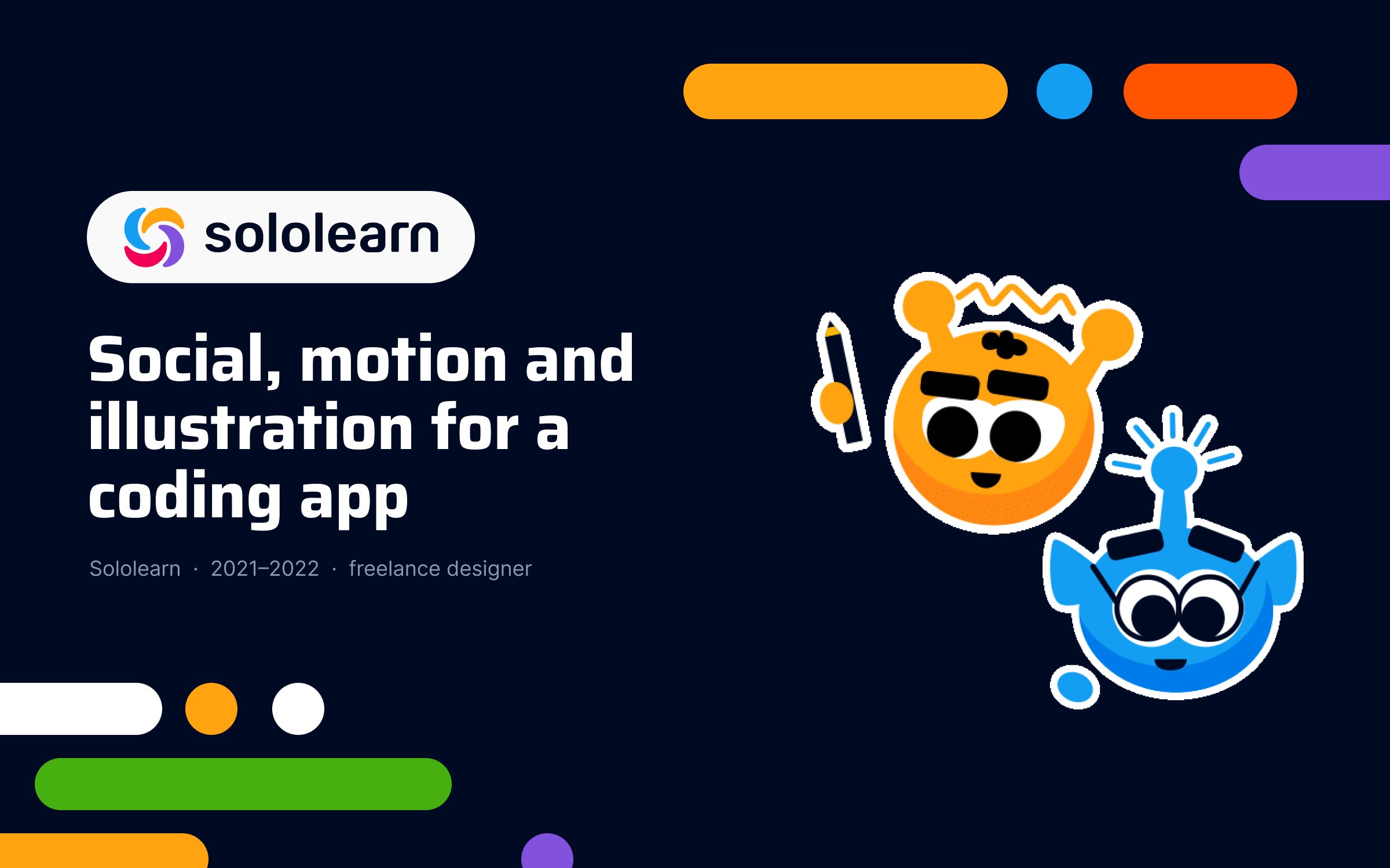
I worked with Sololearn for over a year as a freelance designer: course illustrations, social media posts, animations and lots of promotional and in-house visuals.

I worked with Sololearn for over a year as a freelance designer: course illustrations, social media posts, animations and lots of promotional and in-house visuals.

I worked with Sololearn for over a year as a freelance designer: course illustrations, social media posts, animations and lots of promotional and in-house visuals.

The first version of the logo was simpler and geometric. It even resembled working-class letters to the point.

FROM LOGO TO LAUNCH KIT

What started as "just a logo" became everything the café needed to open:

stickers and stamps, social posts and story templates, profile icons, photos, A5 menus, a loyalty card, business cards, illustrations, color palettes, and short logo animations.

When the logo changed, I went back through every piece and re-tuned it, so the new mark and the existing materials still read as one brand.

One identity, many pieces

Grid, shapes, patterns

Everything sits on a 12-column grid. The shapes come straight from the campus architecture: simplified outlines of the building became a background pattern, frames for photos and solid blocks of colour. That structure is what keeps things calm, even when one menu has to fit red, coffee, cake and a seasonal promo on the same page.

Colour & type

Red (#E20909) is the brand's voice, built out into a full scale from pale pink to almost black and paired with a warm dark (#281F20) and soft pinks.

In everyday use red works as an accent; the launch pieces, like menu covers and opening posts, are allowed to go full red.

colors & Typography

Instrument Sans does the practical work. Instrument Serif comes in for the softer moments: seasonal headings, slogans and little notes like "Cøffee is life!".

GRID, SHAPES

Instrument Sans does the practical work. Instrument Serif comes in for the softer moments: seasonal headings, slogans and little notes like "Cøffee is life!".
Colour & type
Grid, shapes, patterns

Everything sits on a 12-column grid. The shapes come straight from the campus architecture: simplified outlines of the building became a background pattern, frames for photos and solid blocks of colour.

That structure is what keeps things calm, even when one menu has to fit red, coffee, cake and a seasonal promo on the same page.

Red (#E20909) is the brand's voice, built out into a full scale from pale pink to almost black and paired with a warm dark (#281F20) and soft pinks.

In everyday use red works as an accent; the launch pieces, like menu covers and opening posts, are allowed to go full red.

My Role

Social Templates

Illustrated city map on a tablet
hiring posts
Illustrated city map on a tablet

What started as "just a logo" became everything the café needed to open: stickers and stamps, social posts and story templates, profile icons, photos, A5 menus (the everyday "klasyk" and a seasonal autumn edition), a loyalty card, business cards, illustrations, colour palettes and short logo animations.

When the logo changed, I went back through every piece and re-tuned it, so the new mark and the existing materials still read as one brand.

FROM LOGO TO LAUNCH KIT

FROM LOGO TO LAUNCH KIT

What started as "just a logo" became everything the café needed to open: stickers and stamps, social posts and story templates, profile icons, photos, A5 menus (the everyday "klasyk" and a seasonal autumn edition), a loyalty card, business cards, illustrations, colour palettes and short logo animations.

When the logo changed, I went back through every piece and re-tuned it, so the new mark and the existing materials still read as one brand.

FROM LOGO TO LAUNCH KIT

FROM LOGO TO LAUNCH KIT

What started as "just a logo" became everything the café needed to open: stickers and stamps, social posts and story templates, profile icons, photos, A5 menus (the everyday "klasyk" and a seasonal autumn edition), a loyalty card, business cards, illustrations, colour palettes and short logo animations.

When the logo changed, I went back through every piece and re-tuned it, so the new mark and the existing materials still read as one brand.

My Role

One identity, many pieces

Grid, shapes, patterns

Everything sits on a 12-column grid. The shapes come straight from the campus architecture: simplified outlines of the building became a background pattern, frames for photos and solid blocks of colour.

That structure is what keeps things calm, even when one menu has to fit red, coffee, cake and a seasonal promo on the same page.

Colour & type

Red (#E20909) is the brand's voice, built out into a full scale from pale pink to almost black and paired with a warm dark (#281F20) and soft pinks.

In everyday use red works as an accent; the launch pieces, like menu covers and opening posts, are allowed to go full red.

Instrument Sans does the practical work. Instrument Serif comes in for the softer moments: seasonal headings, slogans and little notes like "Cøffee is life!".
Social Templates
Social Templates

Social Templates

Freelance visual and motion designer, working with the marketing team for over a year.

Two audiences, one feed

Sololearn talks to a global, English-speaking community of people learning to code and, at the same time, to its Armenian audience. Every month needed posts for both: the same visual language, different moments, different languages.

What I made

  1. Illustrations: blog headers with the Sololearn mascots, plus course illustrations.

  2. Calendar moments: Programmers' Day, Teachers' Day, Armenian Independence Day and other dates that matter to people learning to code.

  3. #SololearnMentors: a quote series with advice from experienced members of the community.

  4. Back to school: an Instagram carousel with five study-with-me YouTube channels to follow, drawn as one continuous strip across seven slides.

  5. Sololearn Podcast: story covers for season one, in English and in Armenian, with one layout that works for every guest.

  6. Everything in between: course and feature launches, event and meetup ads, recruitment posts and Twitter/X posts in the same style.

Illustrations

illustrations, blog, course, some

Role & decisions

I built a small illustration system that could handle new course topics without slowing down the shipping schedule.

Worked from evolving course specs, defined a grid, shapes and color rules so new graphs and scenes could be designed in hours, not days.

Optimized for tiny mobile sizes first, trading ornamental detail for clarity so illustrations stayed readable in real product conditions.

Documented how to extend the system, which let other designers add modules without breaking the look or accessibility.

What changed

New lessons gained consistent visuals quickly; there was no “visual debt” pile‑up waiting for bespoke illustrations.

Making it move

A lot of it moved. Most posts got at least a small animation, from a two-second mascot loop to longer pieces like "Come code with us", a community video built around a real project in the Code Playground, and the "Coding challenge" intro. On a busy feed, even a little movement makes people stop.

A kit, not one-offs

I built the posts from a small kit: rounded pills and dots in the brand colours, bold type, the mascots and a handful of layouts for quotes, dates, people and announcements. That made it quick to react to news and kept the feed consistent week after week.

Deliverables:
Feed posts · Carousels · Stories · Podcast covers · Blog and course illustrations · Mascot animations · Community and promo videos · Event and recruitment ads · Twitter/X posts

My Role

Let’s Build A Brand Experience That People Remember And Trust

Create a free website with Framer, the website builder loved by startups, designers and agencies.